From The Publisher
 Click here to read the complete article
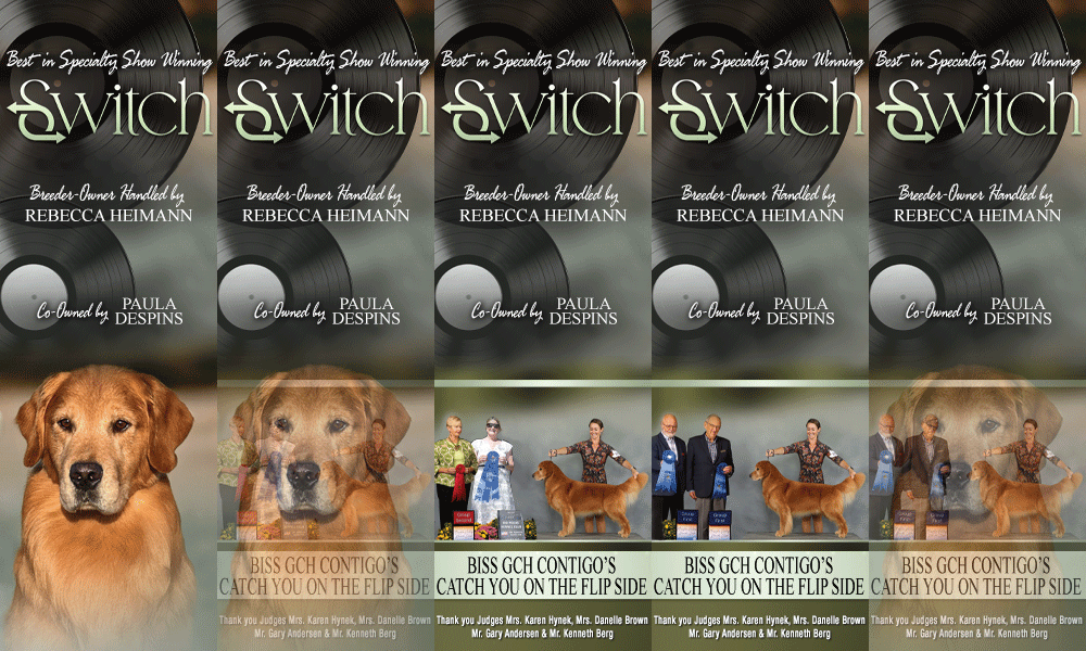
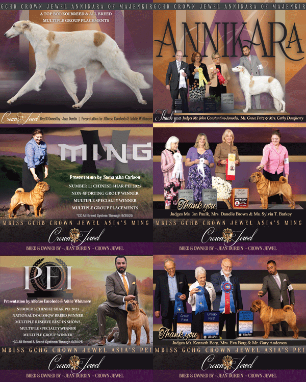
Advertising is an important part of the modern dog show environment and has been for the past three or four decades. The advent of desktop publishing and various advances over the past 20 years have allowed us to create ads for dogs that couldn’t even be imagined in the 1980s.
There are three components to a successful ad, whether it is in print or online. You need great photos, something interesting to say and good design. If any of these components are missing, the ad will not reach its maximum potential to affect the reader.
Publishing a monthly publication along with a website that is constatnly updated allows us to see hundreds of photos of various breeds of dogs every month. Some photos are incredible, others good and a few that, well, could use a little help. Technological advances in photography have allowed everyone with a phone or reasonably priced camera to be a photographer. Whether amateur or professional, the quality of the end product is a direct reflection on the ability of the person clicking the shutter. You know the old adage, “A good mechanic doesn’t blame his tools.”
There are many reasons a photo can be classified as great, good or bad. Color and sharpness are just the beginning. The background is important as is the foreground. Do the elements surrounding the main focus, in this case the dog, add or subtract to the entire composition?
There’s also the dog itself. If a win photo or candid stacked photo is being taken, is the dog being photographed at the most flattering angle? What about the legs – are they set properly? Many times you see photos where the dog is rocking back, or rear legs tucked underneath it, or it is standing with an east-west front or cowhocked rear. Is the topline straight? How about the tail; is it in the proper position? Does the dog look better baited down to show more neck or looking straight out? These are all problems that can be corrected not only by the handler, but also by the person looking through the lens. An extra ten seconds before the photo is snapped can yield much better results.
Let’s talk about moving shots for a moment. Many of the same elements mentioned in the previous paragraph apply to movement shots, too. Head carriage, topline and tailset are all critical elements to a great moving shot. Just because the dog is showing exceptional reach and drive doesn’t mean it looks good. It needs proper carriage as well.
And while we are on the subject of movement shots, it is really important to have the legs on the judges side i.e. in the foreground extended, rather than the legs being extended on the off side. I see more and more photos where the legs reaching and driving are on the wrong side. If the reaching and driving legs are in the foreground, it shows better extension and makes for a much more desirable photo.
Great ads start with great photos. Taking a few moments to set up the shot will result in a photo you will be proud to feature in an ad.
Short URL: http://caninechronicle.com/?p=79712
Comments are closed
